Just in Time for Bike Month: The Active Communities Plan Interactive Map!
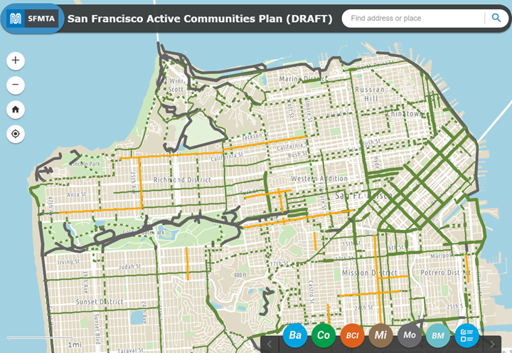
Image of the new Active Communities Plan (ACP ) interactive map
As part of our ongoing public outreach about the Active Communities Plan, the SFMTA has created a new ACP interactive map. The release of the map comes just a couple of weeks after we began collecting feedback through our new survey.
The map shows conditions for biking, scooting and rolling across San Francisco, as well as multiple layers of analysis conducted by the Active Communities Plan team. It is meant to help users understand how different factors like comfort, safety and network quality influence whether people decide to use active transportation or not.
We want users to have the opportunity to explore and compare data, reflect on how it compares to their experiences with active transportation and provide input about what kinds of solutions work best.
The interactive map has six main layers to explore:
- Baseline Data – shows today’s active transportation network, our pipeline of approved projects and the location of every public bike rack in the city.
- Collision Analysis – shows the locations of bike and scooter collisions on the High Injury Network before the pandemic (2017-2019) and since the start of the pandemic (2020-2021), as well as the neighborhoods with the most unreported (unlinked) bike & scooter collisions.
- Comfort Analysis – shows the Bike Network Comfort Index (BCI), which categorizes perceived comfort or risk by people biking, scooting or rolling. This is only our first draft of the BCI – by taking our survey, you can help shape how the BCI is scored!
- Micromobility Analysis – shows what streets people ride most when using BayWheels e-bikes or scooters, which BayWheels stations get the most ridership and the service areas for our micromobility providers.
- Modeshare Analysis – shows data from the American Communities Survey: commute mode share by bicycle and the distribution of zero-car households.
- Bike and Micromobility Activity Analysis – combines our BayWheels e-bike trip data, scooter trip data and modeled bike and scooter trip data from Replica to estimate the volume of trip activity. You can view activity across the city, on the active transportation network or by network facility type.
Once you’ve had a chance to explore our interactive maps, take our survey. The results will help us understand your needs and barriers to active transportation, as well as how safe or comfortable people feel using different types of streets. From there we can develop network, program and policy recommendations that directly reflect the needs and priorities of people across the city. Our survey runs through July 31st.
The Active Communities Plan public engagement effort has reached more than 1,000 residents since January, and we have events scheduled through mid-June with more to come throughout the summer. Visit Active Communities Plan (SFMTA.com/ActiveCommunities) for our schedule, which is updated regularly. If you want us to attend your community meeting or event, contact ActiveCommunities@sfmta.com and let us know!