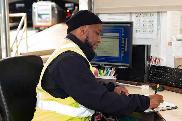
An inspector manages Muni service. New dashboards that help inform changes to Muni service are now live at SFMTA.com/MuniData
Many factors inform our decisions about Muni service adjustments. These include making sure changes to service support the SFMTA’s values, which are economic vitality, environmental stewardship, trust and equity. We also evaluate travel patterns. You can now explore these patterns using the new Muni data dashboards (SFMTA.com/MuniData).
When looking at possible Muni service changes, the first thing we do is turn to the Muni Service Equity Strategy for guidance. Using the Muni Service Equity Strategy, we prioritize providing Muni service along routes that more often serve people of color, members of low-income households, and/or those who are dependent upon transit service, including people with disabilities and seniors.
We also use ridership data to analyze where riders are boarding and where and when there is crowding. This is how we determine if there are opportunities to better align ridership with how often the buses and trains run on specific Muni routes. The Muni data dashboards described below demonstrate some of the different ways ridership data can be sliced for these analyses.
- Systemwide Muni Ridership Recovery - To see how current Muni ridership compares to pre-pandemic ridership, you can view our dashboard that shows Muni system ridership recovery percentage by month from April 2020 to now.
- Muni Ridership Recovery by Route - We also have a view that shows Muni route ridership recovery percentage by month.
- Average Daily Boardings by Route - This dashboard shows average daily boardings by Muni route and month (pre-pandemic to present). It helps transit planners see where riders are boarding Muni and shifts in ridership patterns. The percentages compare ridership in a given month to the same month in 2019. For example, on the 22 Fillmore, ridership increased to 117% of pre-pandemic levels on weekdays and 147% on weekends after we installed transit lanes, increased frequency and rerouted the line to bring people to their jobs and medical appointments in Mission Bay.
- Percent of Daily Trip Crowding by Route - The Crowding dashboard shows each Muni line and the percentage of its trips that are crowded in a month. SFMTA transit planners look at which Muni lines are crowded so that they can determine whether more service is needed to address it.
- Scheduled Service and Ridership Recovery by Route - This dashboard compares how much a route’s pre-pandemic ridership has recovered to how much service is scheduled on each route to meet ridership demand. This comparison can help identify how demand for different routes has changed since the pandemic. (NOTE: “Scheduled service” is not the same as service that was actually delivered. Because of operator shortages, we weren’t able to deliver all the service that was on the schedule pre-pandemic. This is an area we’ve dramatically improved on in recent years so that we are now delivering service that people can count on.)
Using the data described above – while being guided by the SFMTA’s values and the Muni Service Equity Strategy – allows us to make informed decisions about adjusting Muni service to best meet San Francisco’s needs. Now with our new Muni Data dashboards, you can see the numbers that help make these decisions.
Check out our new Muni Data dashboards (SFMTA.com/MuniData).